Dashboard Management
Access to the dashboard
When you access the Dashboards menu on the left panel, the list of existing dashboards appears.
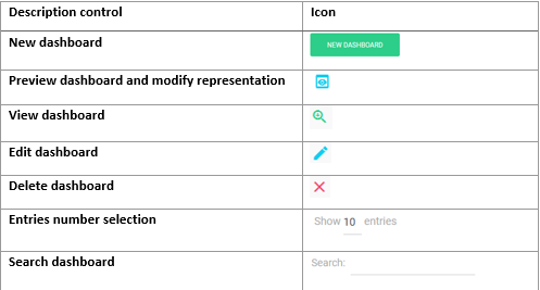
Example Dashboard list :

Controls description:

Create a new dashboard
The creation of a dashboard will be carried out by combining one or more graphs.
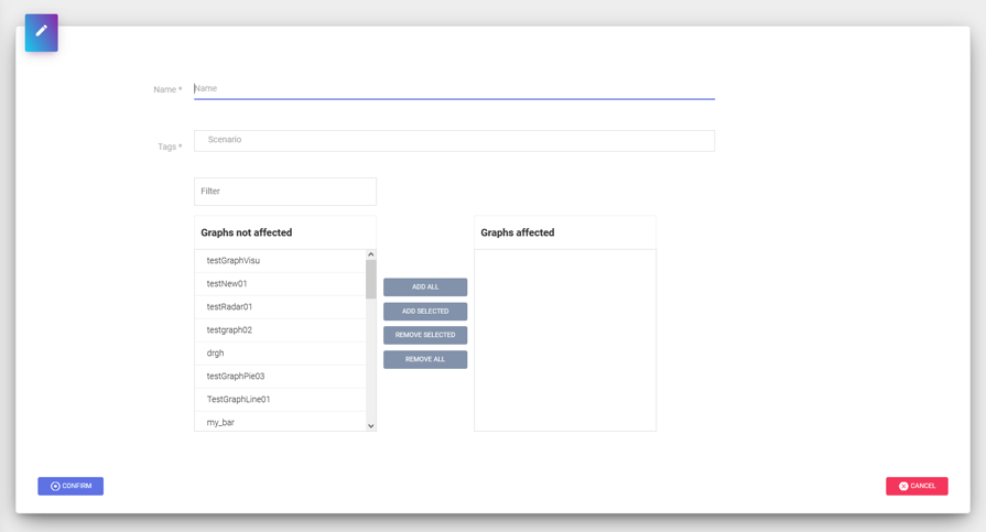
When you click on New Dashboard, the following window is displayed:

After entering the name of your dashboard and related organization tags, you have two sections above:
- The section on the left contains the list of available graphics with the ability to filter
- The section on the right contains the list of graphs associated with your dashboard
In these sections, buttons are available to add, delete, add all, remove all graphs from the dashboard. Once you have selected your charts, you can save it with the Validate button.
Edit a dashboard
Editing a dashboard uses the same principle described in the Creating a dashboard.
You can change the dashboard name, organizations, add or remove graphs.
Delete a dashboard
From the dashboards list, you can delete a dashboard using the red Delete button. You will be asked for confirmation.
Note
For information, deleting a dashboard does not lead to the deletion of associated graphics.
View Dashboard
Visualizing a dashboard offers the following functionalities:
- Visualization of the data collected according to the restitution criteria.
- Export data in different formats.
Note
Management of positioning and sizing of graphics is only available in Preview mode.
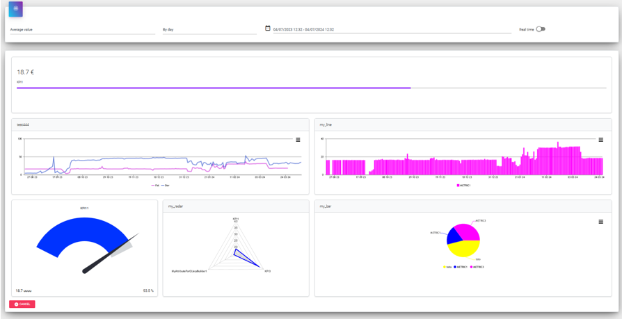
Below is an example of a dashboard visualization:

Criterias for getting data
The visualization of the collected data is carried out according to the restitution criteria below:

Description of criteria:
- The first parameter on the left allows you to select the type of value: average, minimum, maximum or instantaneous value.
- The second one allows you to choose the data aggregation mode according to the selected display period.
- The third criterion offers you a predefined or customized period of time.
- The button on the right in green displays real-time data for a predefined period of time.
Here are the management rules based on the period of time selected by the user:
| Time frame | Value Type | Aggregation Mode |
|---|---|---|
| Last 10 min | Instantaneous value | Per second |
| Last 30 min | Average value, maximum et minimum | Per minute |
| Last hour | Average value, maximum et minimum | Per minute |
| Last 24 hours | Average value, maximum et minimum | Per minute, Per hour |
| Last 24 hours | Average value, maximum et minimum | Per hour, Per day |
| Last 7 days | Average value, maximum et minimum | Per hour, Per day |
| Last 30 days | Average value, maximum et minimum | Per hour, Per day |
| Last 3 months | Average value, maximum et minimum | Per day, Per month |
| Last 12 months | Average value, maximum et minimum | Automatic depending on the period |
Positioning and resizing graphics
Each graph in a dashboard can be resized and its position changed.
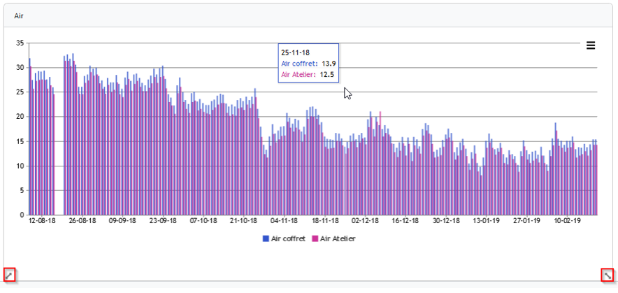
When hovering over a chart two sizing icons appear as shown in red below:

Simply move the mouse to one of its two icons to size the graph.
To move a graph in the same way place the mouse, click and hold on a graph to change its position.
Data export
For each line or bar graph, you can export it in the following formats:
- JPG image format
- PNG image format
- CSV format (in the zip one file per metric)
- Excel XLSX (one tab per metric)
This functionality is available in viewing a dashboard or chart as shown below:

